Entries Tagged as 'Thinking Out Loud'
On Saturday, a friend and I went downtown to the National Portrait Gallery to check out the recently opened Portraiture Now: Drawing on the Edge exhibit.
My first impression: holy crap these folks work big! Every artist in the exhibit with the exception of Rob Matthews works at a massive scale, with pieces stretching nearly from floor to ceiling. This painting by Till Freiwald is 5×6′, and if you can believe it – is watercolor. I don’t know that I’ve ever seen watercolors employed this way, with such opacity while retaining such wonderful translucency. The photograph linked really doesn’t do the painting justice – I think I stared at it from multiple viewing distances for at least ten minutes.
The flip side of that would be the aforementioned Rob Matthews, who was represented at the exhibit with a series named Kindred, a collection of very small, highly technical graphite drawings of his friends and family. Each piece was around 9×9", with a 7×7" drawing framed in a circle in the center of the paper. I was really blown away by the level of detail Mr. Matthews achieves with these drawings and, based on the artist’s statement on the wall proclaiming each work takes roughly 60 hours to complete, I imagine the muscles in his drawing hand must be completely impervious to cramping. My favorite piece of his was a self portrait existing on both sides of a piece of paper, representing a view standing in front of the subject, as well as behind. Very clever.
Another fascinating take on portraiture came from Ben Durham, who’s large scale graphite portraits are actually, upon closer inspection – hand written text. And not lorem ipsum or nonsense, but made up of anecdotes, thoughts, and details about the subject. A collection of these works are here, though the scale of the photos don’t allow you to see the text, unfortunately.
Lastly, and the work I was most looking forward to seeing, were Mary Borgman’s gigantic charcoal portraits. This piece, entitled Portrait of Alex Quatrano was especially striking and powerful. Ms. Borgman stood in stark contrast to Mr. Matthews in terms of technique, being on absolute opposite ends of the “tightness” spectrum, with Ms. Borgman practically attacking the paper with strokes and stabs of charcoal, eraser, chamois cloth, her fingers and who knows what else, but all combining into stunningly personal and vividly realistic pieces at impressive scale.
All in all, a great show – other artists were represented, but the above four stood out for me. The exhibit runs until August 2013, so do go if you have the opportunity.
[Read more →]
Tags: Thinking Out Loud
October 13th, 2012 · 2 Comments
Ann surprised me by putting Autumn Still Life on the cover of this month’s CP Magazine.
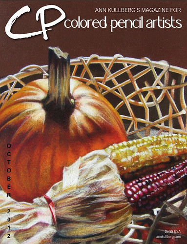
Thanks, Ann!
[Read more →]
Tags: Colored Pencil · Still Life · Thinking Out Loud
November 2nd, 2011 · 1 Comment
Prismacolor has announced 18 new colors in their lineup – and the only reason I’m bothering to mention it is because they are bringing back Deco Pink. Huzzah!
[Read more →]
Tags: Thinking Out Loud
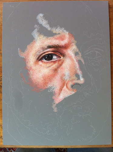
No doubt that when you received this month’s issue of Colored Pencil Magazine you were taken aback by the stunning visage that greeted you on page 16:

“What positively surly splendor!”, you must have said.
“Martha! Come and look at this masterpiece of angry, shaven cranium!”, you surely shouted to your spouse or significant other, who shall henceforth be known as Martha.
“I like every portion of this otherwise distinguished publication except for the top left corner of page sixteen!”, Martha most likely said.
And so it went, you and Martha gazing in wide-eyed wonder and/or loathing at page 16, sipping Boone’s Farm and eating Oreos well into the night. You two really were made for each other, you know. It’s a rare and wonderful thing you have together. We should all be so lucky.
—
In all seriousness, my sincerest thanks to Ann Kullberg for including my drawing in her magazine. It’s very much an honor, and there is loads of great stuff in every issue. Check it out!
[Read more →]
Tags: Colored Pencil · Thinking Out Loud
January 23rd, 2011 · 7 Comments
Rose put up a post on Friday concerning skin tone palettes. While not the topic of the post, Rose mentioned that Ann Kullberg lists a palette of about 20 colors that she uses to create flesh tones. I thought to myself, “Wow … I’ve gone completely overboard, then”.
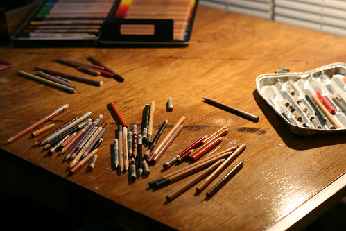
That’s my (recently re-finished) desk, right now, with more than twice the recommended dosage spread across it. My palette has grown substantially since the last time I posted about it, so I thought it might be useful to update that list.
All of these are Prismacolor pencils, except a single Caran d’Ache and a bunch of Lyra Rembrandt Polycolors which are denoted with an asterisk.
Fleshy Colors
- Beige
- Keeps flesh tones nice and warm. I find that skin can get cold and dead looking if a layer of this is never applied.
- Light Flesh*
- A little bit cooler than Beige, acts as a nice medium between Light Peach and Peach.
- Medium Flesh*
- Similar in strength to peach, but warmer.
- Dark Flesh*
- A bit lighter than nectar, and not quite as orangey as Peach.
- Pink Madder Lake*
- A crisp, bright pink. Works well for the pinkish parts of eyelids and blushed cheeks.
- Nectar
- A very dark reddish pink, great for mottled or older skin, or somewhat darker shadows.
- Light Peach
- A highlight color, also used to warm up white highlights.
- Peach
- Mid-tone color, nice for upper eyelids and the shadows under the nose.
- Rosy Beige
- A purplish beige, good for shadows and eyelids.
- Blush
- A darker, warmer pink than Pink Madder Lake.
- Pale Vermillion
- Lips and cheeks.
- Biege Sienna
- Purplish, good lead color for shadows.
Yellows & Oranges
- Cream
- A very light yellow. Great for warm highlights.
- Sand
- Several shades lighter than Ochre, its great at bridging gaps between shadows and warming things up.
- Orange
- I use this to keep shadows warm.
- Yellowed Orange
- Another shadow warmer upper when I dont want them quite so dark as orange would make it.
- Ochre
- A very dark, brownish yellow. Use this around older eyes and when falling into shadow.
- Gold Ochre*
- Darker than Ochre, used in the same way.
Browns
- Indian Red*
- A very warm, rich brown leaning towards red. Mid-range shadows.
- Burnt Ochre
- Lightest brown in the line up. Creases, wrinkles, higher ranged mid-tones.
- Terra Cotta
- Similar to Indian Red, but not as red. First pass shadows.
- Dark Umber
- Very dark brown. Dark shadows, nostrils, etc.
- Pompejan Red*
- Warm reddish brown, redder than Terra Cotta but not as red as Indian Red.
- Van Dyke Brown*
- A cool, medium brown. Used mostly to imply whiskery skin.
- Sepia
- Darker than Van Dyke Brown and slightly warmer.
- Sienna Brown
- The middle brown. Used to merge dark shadows to fleshier tones
- Dark Sepia*
- A very dark brown, much warmer than Dark Umber. Used when warmer shadows are needed.
- Sandbar Brown
- Used in conjunction with Van Dyke Brown
Purples & Reds
- Grayed Lavender
- Very light purple. Nice for thin skin shadows.
- Parma Violet
- Dark purple. Cooler shadows
- Lilac
- Mid range purple, used with Grayed Lavender
- Purple*
- Very dark, warm purple. Dark shadows
- Crimson Lake
- Powerful red for dark, warm shadows.
- Scarlet Lake
- Bright, strong red. Used delicately to darken shadows
Blues & Greens
- Sky Blue Light
- Bright, almost white blue. Direct light highlights.
- Copenhagen Blue
- Strong, very blue. Used with Dark Umber for very dark shadows.
- Blue Slate
- Mid range blue, great for shadows and light reflections.
- Indigo Blue
- Very, very dark blue. Use this with a very dark brown instead of black.
- Dark Green
- Very dark green (surprise!) – used with Crimson Lake for rich, warm shadows.
- Gray Green*
- Lighter green, neutral shadows.
- Night Green*
- Very VERY dark green. Always layered on other darks to make them even darker.
Neutrals
- White (Caran d’Ache)
- Bright, thick white. I use this to blend and roll over other colors. This one goes OVER colors.
- White*
- Warm white, used as a means to lighten the support before colors like Light Peach go over it. This one goes UNDER colors.
- Cool Gray 10%
- Almost, but not quite white. Used when its a bright highlight, but not that bright.
It’s important to note that none of these colors are ever used by themselves. Everything is layered with something else, they are all put down in such a way that when they are layered the other colors can fill in the gaps. The technique and intensity with which they are used varies with factors such as age and skin quality (larger gaps, more varied colors in lighter areas for older folks, but none of that freedom with an infant for example) and the sort of light the person is in (indoor, diffused lighting vs fully outdoor in summer lighting). But, I do use every single one of these colors in every single portrait I do.
And these are just flesh tones, not hair, teeth, backgrounds … oh, wait – I don’t do backgrounds. You get the point. 
[Read more →]
Tags: Colored Pencil · Thinking Out Loud
What, exactly, does one say when they haven’t drawn anything in over a year? Do they explain why? Do they talk about the burnout and the boredom, or do they just post what they are finally working on now, and leave it at that.
Self Portrait VII | Colored Pencil on Pastelbord | 9 x 12"
The latter, it seems.
[Read more →]
Tags: Adult Portraits · Colored Pencil · Thinking Out Loud
Look at what finally came in the mail!
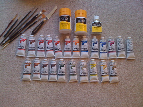
I’m pretty excited to get down to it – I’ve never painted in acrylics before, but spent a lot of time with oils in college, so I’m not a complete painting newbie. I’m thinking my first attempt will be a self portrait – it doesn’t seem fair to butcher someone else’s likeness in a new medium.
Big thanks to my parents, my sister and Rachel for the sundry art supply gift cards that made this possible.
[Read more →]
Tags: Acrylics · Thinking Out Loud
December 31st, 2008 · 7 Comments
Wouldya lookatdat? The year is already over, and so is my break. I suppose its time to figure out the goals for 2009 and see if I managed to hit any of the ones from 2008!
2008’s Goals in Review
- Start working larger
-
Well, sort of. The majority of the stuff I did towards the end of the year was 9×12", and I did a couple that were 9×16". While they aren’t massive, they are bigger than 8.5×11" 
Point being, I suppose, that I did manage to get out of the 8.5×11" habit and start working in some more interesting dimensions which was more the goal than simply creating huge drawings.
- Set up a Photography Area
-
Check! I bought myself a DSLR in October and have been happily taking better shots of my work since.
- Get Back to Working with Clay
-
Oops…didn’t come close to getting that one. There’s always 2009…
- Try Other Mediums
-
The only new medium I tried was carbon pencil. Though I did start working on Pastelbord and Colourfix paper this year – so I did at least try new supports.
- Draw Things other than Faces
-
-
While not a rousing success, and the first didn’t show up until July, I did manage to do 4 non-portraits toward the end of 2008.
I also started working things other than faces into portraits, like clothing and such with several full body portraits, one with a plastic cup and one with a whole lake in the background.
Were you to compare 2007’s body of work with 2008’s, I think you’d find the difference quite apparent.
- Pursue More Commission Work
-
In 2007, 6 of my 45 drawings were commissions. In 2008, out of 29 drawings, 8 were commissions. It’s a better ratio, to be sure, especially considering I had a couple of people back out of them due to economic reasons, and I also backed out of a couple because I didn’t care for the reference photos.
So not bad, but not a total win either. Lets look at 2009’s new and resurrected goals:
Goals for 2009
- Regimented Subject Matter
-
-
This year I intend to limit myself to one or two portraits a month. Most likely just one with the portrait study group I’ve joined. The rest of the time will be spent with other subject matter; still lives, etc.
- New mediums.
-
Specifically acrylics. I have $175.00 worth of art supply gift certificates burning a hole in my pocket, and its acrylic paints that are going to get the lion’s share of it.
- More sellable work
-
The trouble with portraits is that to make any money with them, someone needs to hire you. This is related to the first goal, but I’m going to focus more of my time on doing work that could be attractive to any potential buyer.
- Keep a sketchbook
-
I’ve been doodling in a moleskine for a few weeks now after Carolyn suggested it. I’ve found it to be quite enjoyable and lots of ideas have been popping out of it.
- Less realism
-
I’ve been drawing a lot of silly things straight from my head in my sketchbook, and some of them could be pretty interesting as completed work.
- Regimented Mediums
-
I intend to rotate through mediums this year – colored pencil, graphite/carbon, acrylic and clay. Never two of the same medium in a row! (I expect this to be broken within a month or so)
Lastly, these are my top three favorites from 2008:
- Ganz, the Sequel
- Self Portrait IV
- Pink Sneakers
With honorable mentions going to Rachel, Preston G. and Jump!. You can see my entire 2008 body of work in my gallery to see if you agree.
And what about your goals for the new year? Leave a link to your post about what you intend to accomplish with your art (or whatever you enjoy) in the comments!
[Read more →]
Tags: Thinking Out Loud
December 9th, 2008 · 7 Comments
You’re probably wondering why I’ve not posted the finished drawing that I’ve been working on. I pretty much ruined it. Its not even salvageable; I made a critical mistake in my original line drawing that I didn’t notice until it was too late to do anything about. I’m thinking it’s a by-product of the fits-and-starts method of working that I’ve been employing of late. I’m certain that if I were of a more dedicated mindset that I would have caught the error earlier…and now I’m just burned out because of it. To be fair, I was already feeling somewhat burned out and forcing myself to work…this mistake just pushed me over the edge.
I think I’m going to take the rest of the year off. I hate to end 2008 with a crap drawing, but I’m just not feeling it right now. I’m going to ruminate on some changes to my style and subject matter during what’s left of 2008 and start fresh in 2009.
See you in a few weeks!
[Read more →]
Tags: Thinking Out Loud
Do you listen to music while working? Me, I can’t do without it. I also can’t abide my iPod on shuffle; its too distracting to stop and skip a song I don’t feel like listening to, so I have a few specific albums I’ll spin up to get myself into the zone. My current top five are:
- Dax Riggs, We Sing Only of Blood or Love
- Serj Tankian, Elect the Dead
- Faith No More, Angel Dust
- Flyleaf, Flyleaf
- Deadboy and the Elephantmen, If This is Hell I’m Lucky
Some close runner’s ups, in no particular order, are:
I also have a Pandora station seeded with the Dead Kennedys, Red Hot Chili Peppers, Dax Riggs and Slayer that I listen to pretty regularly. For those unfamiliar, Pandora asks you what sort of music you like, and then plays stuff that it thinks you’ll also like.
And you? What do you listen to in your studio?
[Read more →]
Tags: Thinking Out Loud
