
Rose put up a post on Friday concerning skin tone palettes. While not the topic of the post, Rose mentioned that Ann Kullberg lists a palette of about 20 colors that she uses to create flesh tones. I thought to myself, “Wow … I’ve gone completely overboard, then”.
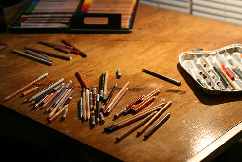
That’s my (recently re-finished) desk, right now, with more than twice the recommended dosage spread across it. My palette has grown substantially since the last time I posted about it, so I thought it might be useful to update that list.
All of these are Prismacolor pencils, except a single Caran d’Ache and a bunch of Lyra Rembrandt Polycolors which are denoted with an asterisk.
Fleshy Colors
- Beige
- Keeps flesh tones nice and warm. I find that skin can get cold and dead looking if a layer of this is never applied.
- Light Flesh*
- A little bit cooler than Beige, acts as a nice medium between Light Peach and Peach.
- Medium Flesh*
- Similar in strength to peach, but warmer.
- Dark Flesh*
- A bit lighter than nectar, and not quite as orangey as Peach.
- Pink Madder Lake*
- A crisp, bright pink. Works well for the pinkish parts of eyelids and blushed cheeks.
- Nectar
- A very dark reddish pink, great for mottled or older skin, or somewhat darker shadows.
- Light Peach
- A highlight color, also used to warm up white highlights.
- Peach
- Mid-tone color, nice for upper eyelids and the shadows under the nose.
- Rosy Beige
- A purplish beige, good for shadows and eyelids.
- Blush
- A darker, warmer pink than Pink Madder Lake.
- Pale Vermillion
- Lips and cheeks.
- Biege Sienna
- Purplish, good lead color for shadows.
Yellows & Oranges
- Cream
- A very light yellow. Great for warm highlights.
- Sand
- Several shades lighter than Ochre, its great at bridging gaps between shadows and warming things up.
- Orange
- I use this to keep shadows warm.
- Yellowed Orange
- Another shadow warmer upper when I dont want them quite so dark as orange would make it.
- Ochre
- A very dark, brownish yellow. Use this around older eyes and when falling into shadow.
- Gold Ochre*
- Darker than Ochre, used in the same way.
Browns
- Indian Red*
- A very warm, rich brown leaning towards red. Mid-range shadows.
- Burnt Ochre
- Lightest brown in the line up. Creases, wrinkles, higher ranged mid-tones.
- Terra Cotta
- Similar to Indian Red, but not as red. First pass shadows.
- Dark Umber
- Very dark brown. Dark shadows, nostrils, etc.
- Pompejan Red*
- Warm reddish brown, redder than Terra Cotta but not as red as Indian Red.
- Van Dyke Brown*
- A cool, medium brown. Used mostly to imply whiskery skin.
- Sepia
- Darker than Van Dyke Brown and slightly warmer.
- Sienna Brown
- The middle brown. Used to merge dark shadows to fleshier tones
- Dark Sepia*
- A very dark brown, much warmer than Dark Umber. Used when warmer shadows are needed.
- Sandbar Brown
- Used in conjunction with Van Dyke Brown
Purples & Reds
- Grayed Lavender
- Very light purple. Nice for thin skin shadows.
- Parma Violet
- Dark purple. Cooler shadows
- Lilac
- Mid range purple, used with Grayed Lavender
- Purple*
- Very dark, warm purple. Dark shadows
- Crimson Lake
- Powerful red for dark, warm shadows.
- Scarlet Lake
- Bright, strong red. Used delicately to darken shadows
Blues & Greens
- Sky Blue Light
- Bright, almost white blue. Direct light highlights.
- Copenhagen Blue
- Strong, very blue. Used with Dark Umber for very dark shadows.
- Blue Slate
- Mid range blue, great for shadows and light reflections.
- Indigo Blue
- Very, very dark blue. Use this with a very dark brown instead of black.
- Dark Green
- Very dark green (surprise!) – used with Crimson Lake for rich, warm shadows.
- Gray Green*
- Lighter green, neutral shadows.
- Night Green*
- Very VERY dark green. Always layered on other darks to make them even darker.
Neutrals
- White (Caran d’Ache)
- Bright, thick white. I use this to blend and roll over other colors. This one goes OVER colors.
- White*
- Warm white, used as a means to lighten the support before colors like Light Peach go over it. This one goes UNDER colors.
- Cool Gray 10%
- Almost, but not quite white. Used when its a bright highlight, but not that bright.
It’s important to note that none of these colors are ever used by themselves. Everything is layered with something else, they are all put down in such a way that when they are layered the other colors can fill in the gaps. The technique and intensity with which they are used varies with factors such as age and skin quality (larger gaps, more varied colors in lighter areas for older folks, but none of that freedom with an infant for example) and the sort of light the person is in (indoor, diffused lighting vs fully outdoor in summer lighting). But, I do use every single one of these colors in every single portrait I do.
And these are just flesh tones, not hair, teeth, backgrounds … oh, wait – I don’t do backgrounds. You get the point. ![]()
7 responses so far ↓
1 Rose welty // Jan 23, 2011 at 4:19 pm
This is great Steve. I have always thought that adding blues, greens, and purples added zip. You do render nice skin tones. I’ll have to give some of these a go.
I always knew you were complicated….
2 S.G. Chipman // Jan 23, 2011 at 9:48 pm
Thanks Rose … I’m curious – are there any colors in Ann’s list that I’m missing?
3 “Alexandra”, Update #3 // Jan 24, 2011 at 8:24 am
[...] Yesterday’s post on skin tone palettes has made me much more conscious of my color choices as I work; I usually just grab what feels right and don’t give it a lot of consideration. I’m honestly surprised by the amount of purple I’m using on this one. I’ve also added “Rose Madder Lake” to the mix, a very hot magenta from Lyra Rembrandt. [...]
4 Rose welty // Jan 24, 2011 at 9:47 am
Ann’s list also includes Jasmine, Deco Pink (I think it is discontinued), Pink Rose, Yellow Ochre, Mineral Orange, Blush Pink, Goldenrod, Clay Rose, Pink, Light Umber, Pumpkin Orange, Dark Brown, Henna, Tuscan Red, and Black.
5 S.G. Chipman // Jan 24, 2011 at 6:34 pm
Ah, good ‘ol Deco Pink. I still have a tiny, tiny nub of that.
Black in skin tones, eh? Interesting … the only thing I ever use black for are pupils and eyelashes. And my signature. My opinion is its to flat a color for anything else – you get much better results with dark blues/browns layered together, I think.
6 Scott // Jul 28, 2011 at 2:30 am
What about lightfastness. A lot of the colors mentioned above are not very lightfast. Prisma color ones. I read the Lyras are nice lightfastness.
7 S.G. Chipman // Jul 28, 2011 at 10:38 am
I’d have a pretty limited palette if I worried about lightfastness.
For what its worth, I do have work that is approaching the 10-15 year mark, and it is unaffected. (Unless it just turns white on it’s 20th anniversary …)
I’m not sure if that has to do with fixative/support/not hanging it in a tanning booth/etc, but I don’t lie awake at night fretting over it
Leave a Comment