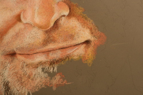
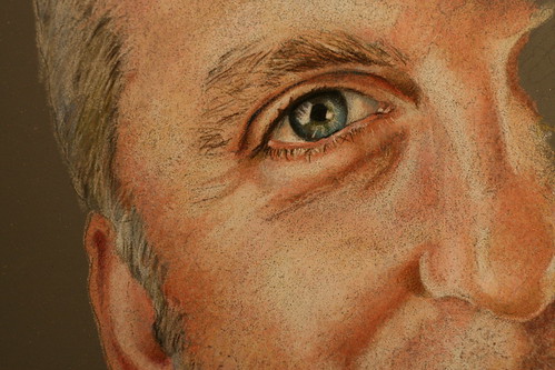
A couple of folks have asked if I would post close up, high resolution photos of this drawing to allow them to better examine the color layering and pencil strokes. Hopefully these are what you guys are after – the images link to their original 3888×2592 photos. I’ll take some additional photos tomorrow morning in daylight for better color accuracy – these are all a bit on the red side.
My stroke is always small, circular motions. I leave lots of gaps when laying down initial layers for other colors to fill in. For the most part its fairly erratic as you can tell from what’s been laid down on the fringes.
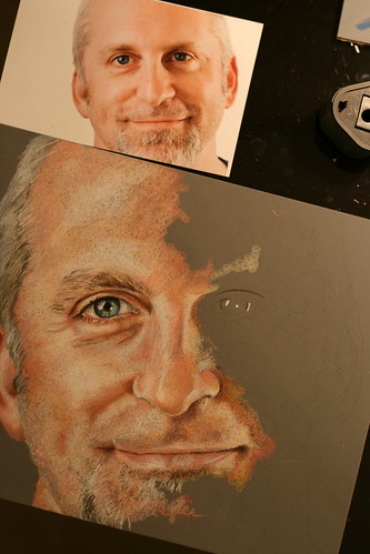
Here’s where the drawing stands at the moment, by the way:

And for no particular reason, here’s a photo of my pencils that I thought turned out interesting:


3 responses so far ↓
1 Jeffrey Miller // Oct 9, 2008 at 7:24 am
Is your hand heavy or soft when you are working on one of your works?
2 Jeanette // Oct 9, 2008 at 7:57 am
Thank you so much Steve!! Its just what I was looking for. I think I’m on the right track with mine now.
And that photo of the pencils is quite draw worthy too.
3 S.G. Chipman // Oct 9, 2008 at 9:08 am
@Jeffery Very soft – with colored pencils if you go heavy out of the gate you’ll start to burnish and then the support will stop taking color. Of course, towards the end when burnishing is desired I go pretty heavy, usually with white or cream.
@Jeanette I was thinking the same thing
Leave a Comment