I’ve not decided on a title for this one yet. This is a somewhat close-up, cropped shot in poor light. Hopefully tomorrow morning after another session with it I’ll manage a better shot with daylight on my side.
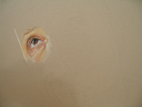
Colored Pencil on Pearl Mi-Teintes Board, 16 x 9″
(Yes, its a self-portrait)
Tags: Adult Portraits · Colored Pencil · Work In Progress
February 5th, 2008 · 4 Comments
This is a repeat of a post I made on slayeroffice back in September, but since this blog (newly renamed Wax Bloom if you hadn’t noticed) has a different audience, I figure a repost isn’t entirely out of line.This is a time lapse video I created of myself working on my drawing of Owais – six hours of drawing condensed into about four minutes. Enjoy!
Update The embedded video was slowing down page render too much. Follow this link if you’d like to watch.
Tags: Colored Pencil
February 4th, 2008 · 3 Comments
Jeanette Jobson asked about the color palette I used on Nate & Hannah. I replied in the comments with the palette, but thought I’d make a post about the palette I use for portraits with a bit more detail since the colors are generally the same in all of the portraits I do – what varies are the intensities depending on complexion.
- Beige
- The base color I use for medium Caucasian and Asian complexions.
- Peach
- Used for rosiness in cheeks and as a preliminary layer for shadows.
- Salmon Pink
- Used as a secondary layer for shadows.
- White
- When used on colored paper, preliminary layer color for highlights. On white paper, strictly for burnishing.
- Light Peach
- Alternate base color for lighter complexions.
- Copenhagen Blue
- I use this color for very dark shadows, and always in conjunction with Dark Umber.
- Blue Slate
- Used for light shadows as well as highlights. I use this color a lot.
- Warm Gray 10 & 20%
- Shadows in eyes, stubble.
- Sienna Brown
- Used in shadow layers after applications of Peach and Blue Slate.
- Terra Cotta
- For warming up shadows over Sienna Brown.
- Light Umber
- For brown hair.
- Deco Pink
- This color is perfect to blend flesh tones into highlights. Unfortunately, its been discontinued by Prismacolor. I have a half inch stub left that I use sparingly.
- Rosy Beige
- This is a purplish/grayish color that works well for cool shadows.
- Dark Green
- For very dark shadows. Often combined with Scarlet Lake.
- Pink Rose
- Cheeks and transitions into shadow.
- Blush Pink
- Another heavily used color. Used as the second layer of color over Beige.
- Cream
- Used for transitions between flesh tones and bright highlights.
- Sand
- For hair, as well as the base color for very dark complexions, such as in this one.
- Parma Violet
- Used for cool shadows on light complexions.
- Dark Umber
- For shadows, often coupled with Copenhagen Blue.
- Grayed Lavender
- Cool shadows on light complexions.
- Scarlet Lake
- For warming up shadows.
Of course, your milage may vary and there may be colors in your subject that aren’t in this list and vice-versa. The main thing to remember – use more than the preconceived colors you believe make up a skin tone. If you’re only using peaches and pinks, you’ll end up with a drawing that feels flat. Play around with subtle additions of color in many layers and you’ll be pleased with this results.
Tags: Colored Pencil · Thinking Out Loud
February 4th, 2008 · 2 Comments
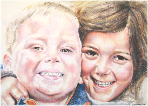
Colored Pencil on Cold Press Illustration Board
Tags: Child Portraits · Colored Pencil · Completed Work
February 3rd, 2008 · 4 Comments
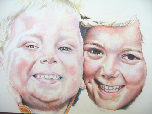
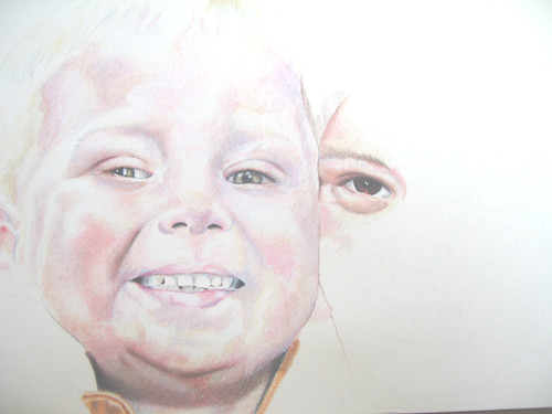
Colored Pencil on Cold Press Illustration Board, 14 x 10″
Tags: Child Portraits · Colored Pencil · Work In Progress
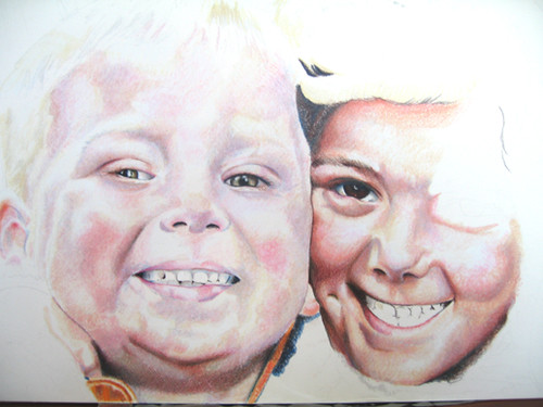
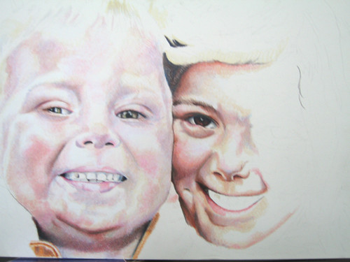
Colored Pencil on Cold Press Illustration Board, 14 x 10″
Tags: Child Portraits · Colored Pencil · Work In Progress
February 1st, 2008 · 2 Comments
Mostly just adding more layers to what was already there and darkening shadows in this blurry, lets call it “action”, shot.
Colored Pencil on Cold Press Illustration Board, 10 x 14″
Tags: Child Portraits · Colored Pencil · Work In Progress
January 29th, 2008 · 7 Comments
Rose tagged me for everyone’s favorite “Five Things You Don’t Know About Me” meme, so here goes. Prepare to be enlightened! Or something!
- I play the drums.
- And I’ll bet if you sit around me at work, the incessant tapping on my desk in rhythm to whatever I’m listening to on my iPod probably gave that away.
- I work for AOL.
- I started in late ‘99, just in time for the stock to hit its peak and be completely useless to me. And if you knew that I played drums by way of hearing me tap on my desk, then you already knew this one too.
- I used to smoke.
- Two packs of Basic Lights a day, but I quit three years ago. Now I can’t abide it.
- Until 2003, I’d never been outside of the U.S..
- And since then I’ve been to Germany, Austria, Ireland, Greece, Turkey, and the UK.
- My wife and I are expecting our second child in March.
- A boy!
Of course, a meme isn’t a meme if it isn’t passed on, so…
- Jeanette Jobson, because she left such a nice comment about Nate & Hannah.
- Cindy Li, even though I’m sure she’s been tagged with this meme before but without her excellent photographs to work from, a lot of my portraits wouldn’t exist.
- Kevin Lawver, because outside of my own family, I’ve drawn more Lawvers than anyone else.
- Paulette, because she was nice enough to add me to her blogroll.
- Stuart Langridge, because this is just the sort of thing that I’m sure would conjure a litany of curses from him just for being tagged. And that amuses me.
Not that I expect any of you to carry it on. Well, except Stuart.
Tags: Thinking Out Loud
January 28th, 2008 · 5 Comments
Colored Penil on Cold Press Illustration Board, 14 x 10″
Tags: Child Portraits · Colored Pencil · Work In Progress
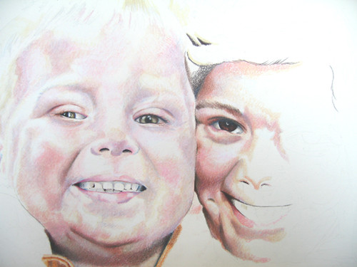
Nate’s had some refinements made and Hannah begins to appear in this short session I squeezed in over lunch:
Tags: Child Portraits · Colored Pencil · Work In Progress
